Please read the Licensing terms before you download this content.
Overview
Our Games framework requirements ensure a consistent experience across our ever-growing portfolio of games. By standardising elements of the game UI we can spend more time crafting unique gameplay experiences.
Eight requirements for inclusive design
1. Inputs
Users can navigate the game GEL UI via touch, mouse and keyboard (tab and enter, minimum) with access to an 'exit' button.
By meeting this requirement, GEL UI becomes accessible on external switch devices, eye gaze software and any mouse mimicking hardware.
Use cases
- Players who have restricted motor skills
- Helps support comprehension
- Players with cognitive impairments
2. Colour
The colour of text and background content has sufficient contrast.
Text, icons and graphics under 24px (18pt)
Colour contrast must meet 4.5:1 ratio.
Text, icons and graphics equal to or over 24px (18pt)
Colour contrast must meet 3:1 ratio.
Icons or patterns
Use icons or visual patterns alongside colour to differentiate between elements. This allows us to convey meaning in more than one way.
Use cases
- Players with vision impairment
- Players with colour blindness
- Players with cognitive impairment
- Accommodates lower specification devices
3. Structure
Buttons and other interactive elements are clearly distinguishable and have visible state changes (for hover, focus and press).
All game screens have a left to right, top to bottom focus order.
Use cases
- Anyone playing a game using keyboard, touch or mouse
4. Audio
All GEL UI and notifications have an audio equivalent and are perceivable by assistive technology.
Some players may not be able to see visual content. Having an audio equivalent in addition to the media that can be perceived also supports comprehension. Multiple delivery formats also help cognitively impaired users.
Use cases
- Players who struggle to see visual content
- Pre-literate players who need support with comprehension
- Players with cognitive impairments
5. Visual
All key audio has a visual or text equivalent presented in a logical, readable manner that does not auto advance. Key information is not conveyed by audio only.
Use cases
- Users who struggle to hear
- Users playing with the volume down
6. Hit areas
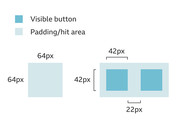
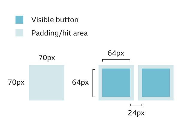
All target sizes are large enough to compensate for inaccuracies.
Use cases
- Players with motor impairments
- Anyone playing a game on the move
- All young players who are using devices for the first time
7. Onboarding
Onboarding and 'how to play' sections are included and should be replayable. Instructions are both visible and audible and do not auto advance.
Use cases
- First time visitors to the game
- Players who need help in the game
8. Sound and VFX
Visual effects and audio do not play automatically unless the user has interacted with the game, and a 'pause'/'stop'/'mute' button is provided.
All games must have an option to turn both audio and and non-essential animation off.
Canvas size
Games are built to adapt to any screen ratio. But the core gameplay must be contained in a 4:3 safe area to allow it to work across all displays and scale appropriately.
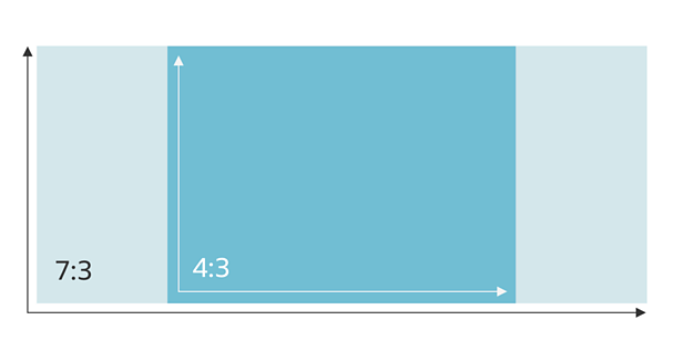
4:3
Core gameplay must be contained in a 4:3 safe area. All games should allow a bleed area where the games scenery should continue to avoid letterboxing.
7:3
To create the sense of a fullscreen experience, background graphics should continue to a recommended ratio of 7:3.
Padding
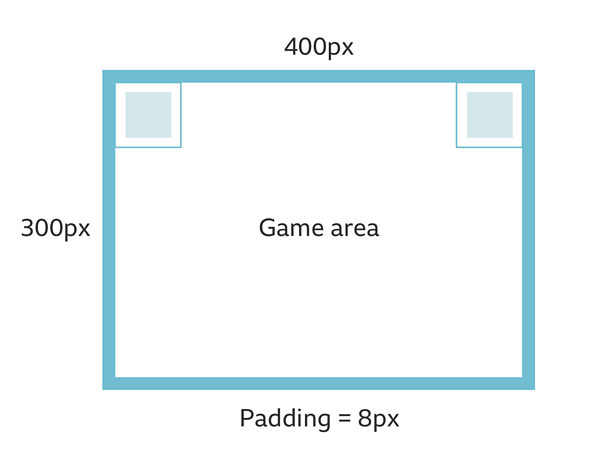
Standard Padding
The padding around each game should be 2% of the longest side of the viewport. For example, the image below shows 2% of 400px = 8px padding.
Game flow
Keeping navigation simple and logical.
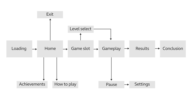
An example game flow includes loading, home, exit, how to play, achievements, game slot, level select, gameplay, pause, settings, results and conclusion.
Screen layouts
'Loading' screen
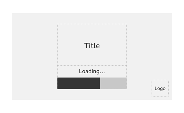
Title
Positioned in the centre of the screen. This can take any form that conveys the game within the space.
Loading
This is positioned below the game title in the centre of the screen. Progress should be clearly indicated.
Logo
Positioned in the bottom right of the screen. This should be the logo of the brand i.e. C≥…»ÀøÏ ÷, CBeebies or Bitesize.
'≥…»ÀøÏ ÷' screen
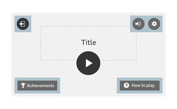
'Exit' button
Primary button positioned in the top left of the screen. Returns user to 'launch' screen.
Title
Positioned in the top middle of the screen. This can take any form that conveys the game within the space.
'Audio toggle' button
Tertiary button positioned in the top right of the screen, to the left of the 'settings' button. Toggles audio on/off, replaced by 'mute' icon if muted.
'Settings' button
Tertiary button positioned in the top right of the screen. Launches the 'settings' screen.
'Play' button
Primary button positioned in the middle of the screen. Primary Call To Action (CTA).
'Achievements' button
Secondary button position in the bottom left of the screen. Used if achievements are present in the game.
'How to play' button
Secondary button positioned in the bottom right of the screen (not a requirement for CBeebies games). Launches 'how to play' screen.
'Game slot' screen
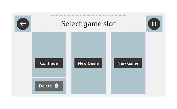
'Back' button
Primary button positioned in the top left of the screen. Returns users to the previous screen.
Title
Positioned in the top middle of the screen.
'Pause' button
Primary button positioned in the top right of the screen. Launches the 'pause' screen, stops all background music and movement.
'New Game Slots'
Three game slots positioned in the centre of the screen, each slot takes the user into a new game.
'New Game' button
Positioned within a new game slot. Takes the user into a new game.
'Saved Game Slot'
If a new game slot has been previously played it will now appear as a saved game slot.
'Continue' button
Primary button positioned within a saved game slot. Takes the user back into the saved game.
'Delete' button
Secondary button positioned below the 'continue' button in a saved game slot. Launches a delete modal allowing user to confirm or cancel their choice to delete the game slot.
'Modal' screen
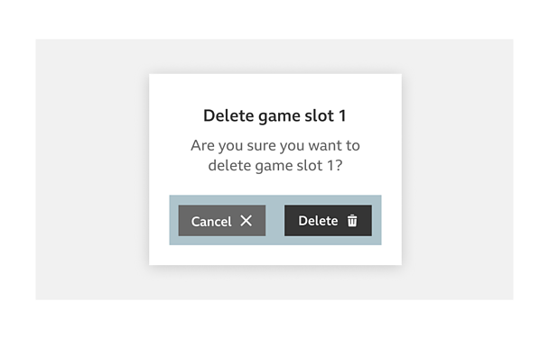
Title
Positioned in the top middle of the modal.
Supporting dialogue
Positioned below the title, this provides information or a description of the modals' outcome i.e. 'Are you sure you want to delete game slot 1',
Buttons
Positioned below the supporting dialogue, up to 3 buttons are shown for the user to select from. If required, a close button can also be placed in the top right of the modal.
'Character'/'level select' screen
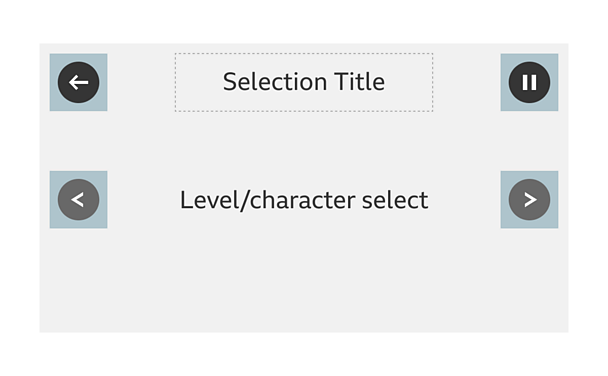
'Back' button
Primary button positioned in the top left of the screen. Returns users to the previous screen.
Title
Positioned in the top middle of the screen.
'Pause' button
Primary button positioned in the top right of the screen. Launches 'pause' screen, stops background music and movement.
Carousel navigation
Positioned in the centre of the screen, with the 'previous' button on the left and 'next' button on the right.
'How to play' screen
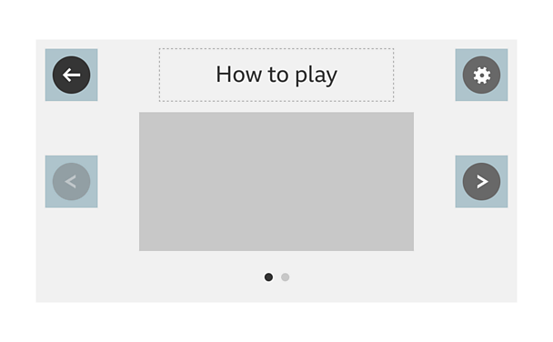
'Back' button
Primary button positioned in the top left of the screen. Returns users to the previous screen.
Title
Positioned in the top middle of the screen.
'Settings' button
Tertiary button positioned in the top right of the screen. Launches the 'settings' screen.
Carousel navigation
Positioned in the centre of the screen, with the 'previous' button on the left and 'next' button on the right. Can be styled around the brand and game.
Help content
Positioned in the middle on the screen, in the middle of the carousel navigation. Contains instructions relevant to the game.
'Narrative' screen
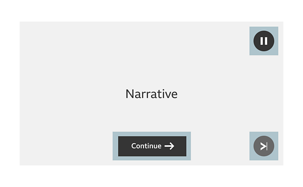
'Pause' button
Primary button positioned in the top right of the screen. Launches the 'pause' screen, stops all background music and movement.
'Continue' button
Primary button positioned in the middle of the screen. Continues to the next segment of narrative when the user is ready to proceed.
'Skip' button
Secondary button positioned in the bottom right of the screen. Enables a player to skip all narrative and go straight to gameplay.
'Gameplay' screen
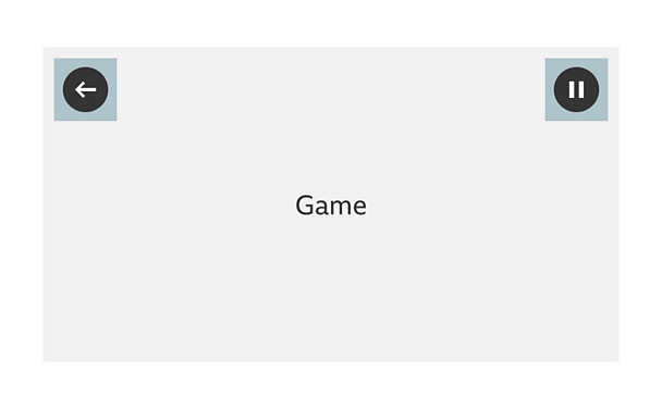
'Back' button
Primary button positioned in the top left of the screen. Has to be present during gameplay in CBeebies games, but can also be used to get back out of a zoomed in view for C≥…»ÀøÏ ÷ and Bitesize games. For example, zooming in to a cauldron in a potions room or zooming in to a book on a table.
'Pause' button
Primary button positioned in the top right of the screen. Launches the 'pause' screen, stops all background music and movement.
'Results' screen
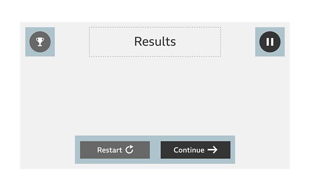
'Achievements' button
Secondary button position in the top left of the screen. Used if achievements are present in the game.
Title
Positioned in the top middle of the screen.
'Restart' button
Secondary button positioned in the bottom middle of the screen, to the left of the 'continue' button. Returns users to the beginning of the level. Should be changed to the 'play again' button if it's the end of the game.
'Continue' button
Primary button positioned in the bottom middle of the screen, to the right of the 'restart' button. Continues to the next level or other appropriate screen. Should direct users to the end credits or 'home' screen if it's the end of the game.
'Pause' screen
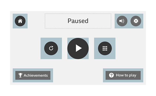
'≥…»ÀøÏ ÷' button
Primary button positioned in the top left of the screen. Returns users to the 'home' screen.
Title
Positioned in the top middle of the screen.
'Audio toggle' button
Tertiary button positioned in the top right of the screen, to the left of the 'settings' button. Toggles audio on/off, replaced by 'mute' icon if muted.
'Settings' button
Tertiary button positioned in the top right of the screen. Launches the 'settings' screen.
'Restart level' button
Primary button positioned in the middle the screen, to the left of the 'resume/play' button. Returns user to beginning of level.
'Resume/play' button
Primary button positioned in the middle of the screen, in the middle of the 'restart' and 'level select' buttons. Returns the user to gameplay.
'Level select' button
Primary button positioned to the right of the 'resume/play' button. Returns user to the 'level select' screen.
'Achievements' button
Secondary button position in the bottom left of the screen. Used if achievements are present in the game.
'How to play' button
Secondary button positioned in the bottom right of the screen (not a requirement for CBeebies games). Launches 'how to play' screen.
'Rotate device' screen
Use brand appropriate tone of voice for the message. The 'rotate device' message must also be readable by a screen reader
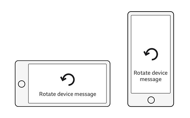
This screen gives clear instruction to the user on which orientation the users device needs to be in for gameplay.
Licensing
These assets are available for download on the following licence terms:
You can:
- Download the assets and use them free of charge;
- Use the assets without attribution; and
- Modify or alter the assets and edit them as you like.
You can't:
- Use the assets in a way that would bring the ≥…»ÀøÏ ÷ into disrepute;
- Make available the assets so that they can be downloaded by others;
- Sell the assets to other people or package the assets with others that are for sale;
- Take payment from others to access the assets (including putting them behind a paywall);
- Use the assets as part of a service that you are charging money for; or
- Imply association with or endorsement from the ≥…»ÀøÏ ÷ by using the assets.
Disclaimer: The assets are offered as is and the ≥…»ÀøÏ ÷ is not responsible for anything that happens if you use them.


