Overview

How it works
Overall rating and call to action (CTA)
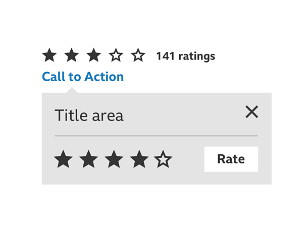
If other people have rated a piece of content, the overall rating is displayed together with how many people have rated. Beneath this is a CTA inviting you to rate. If no one has rated this content before, only the CTA is displayed inviting you to be the first to rate.

Rating panel
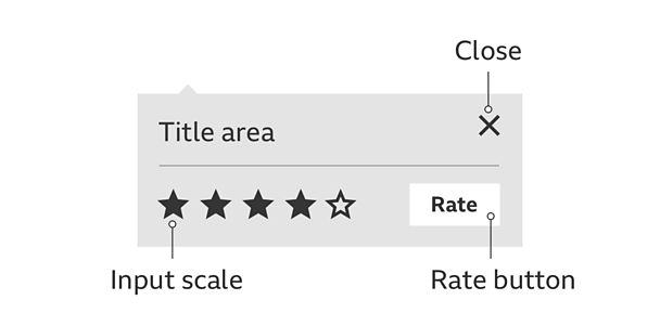
The ratings panel uses the information panel pattern. It includes a title area, close button, input scale and rate button.

Input scale
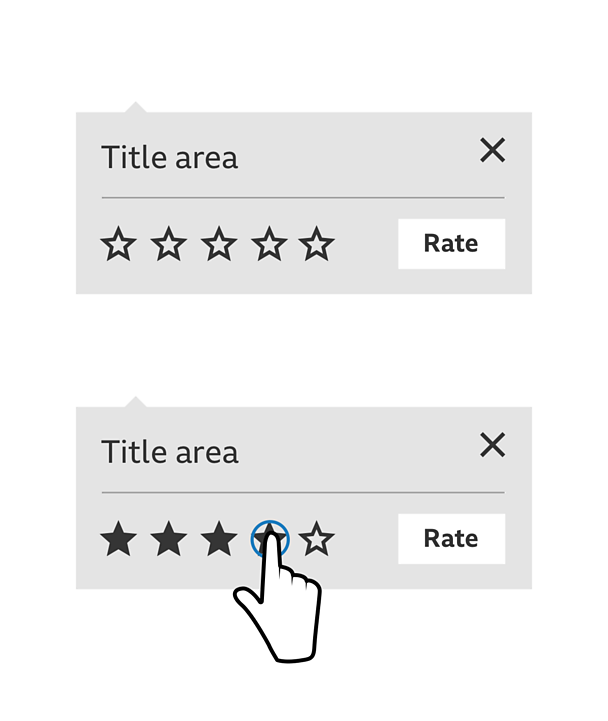
The scale is made up of 5 stars. By default, these are outlines indicating no rating has been selected. With no rating selected, the rate button is disabled but becomes enabled once a star is tapped. A user is free to change their selection until they select the rate button and their rating is submitted.
Input scale hover states
Hovering on the stars within the scale displays the rating that would be made should you press select. Pressing on a star selects a rating and the highlighted stars 'pulse' to indicate a selection has been made. Moving off from the scale without making a selection returns the scale to your last selected rating. If no stars have been selected, the scale returns to its default empty state.

Close
You can close the ratings panel by selecting the 'x' close button or selecting outside the panel.
Thanks for rating!
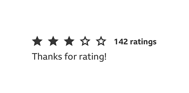
Your rating is submitted by selecting the rate button. The ratings panel disappears and a confirmation message thanking you for rating replaces the original CTA. Your rating is added to the overall rating for the content and the confirmation is replaced by a CTA allowing you to edit your rating.

Edit your rating
Selecting to edit your rating opens the rating panel and your most recently submitted rating is displayed in the input scale. You can then use the input scale to select a new rating, then select the rate button to submit. Your previous rating is overwritten.
Rules
- Ratings panel placement should follow the information panel pattern.
- Colours can be changed but you need to make sure there's a clear selected/filled and unselected/empty state for the stars.
Accessibility
Visual considerations
- Make sure the colour of the text and stars contrast well with the backgrounds of the input panel.
- Use 'pulse' to offer visual feedback when selecting from the input scale.
Screen readers
- Ratings is fully accessible if you're using a screen reader
- Navigate to, and select the CTA to open the ratings panel
- Navigate across the input scale and press the enter key to select a rating
- Navigate onto the rate button and use the return key to submit your selected rating
Tabbing order
When the rating panel is open, the tabbing order is left to right starting with the input scale. The panel is non-modal and tabbing off the panel closes it, and returns focus to the call to action.
Pattern in action
This pattern is currently being used by łÉČËżěĘÖ Food.

