Overview
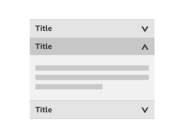
How it works
At its most granular form an accordion can be broken down into an individual component. This can be referred to as a drawer. This is made up of a drawer header and content panel.
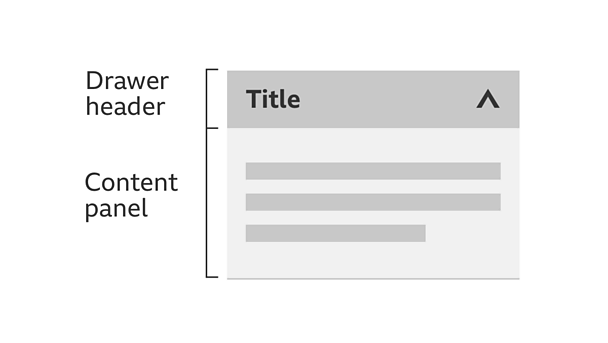
Using an accordion to group content into individual drawers leads to shortened pages and reduced scrolling. It's in your control to either open or close a drawer.
Note
Remember to look at our touch guidelines for more information on making your designs touch-friendly.
Drawers within an accordion have three different states; collapsed, hover and expanded.
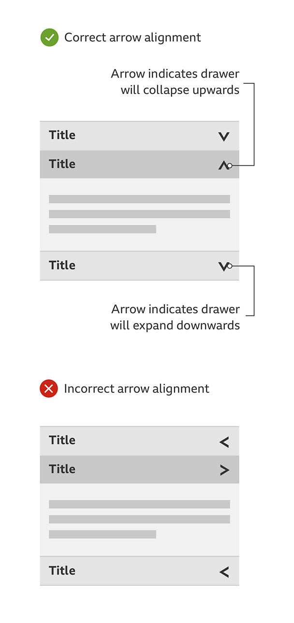
Collapsed state: The title should be clearly identifiable in bold with the arrow pointing down, showing the direction that content will expand.
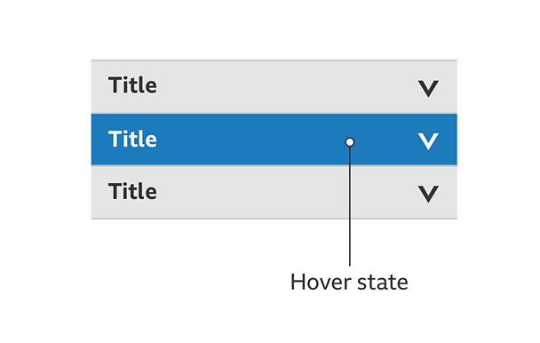
Hover state: Interacting with the component triggers the hover state. Examples of a hover state could be changing the background colour.
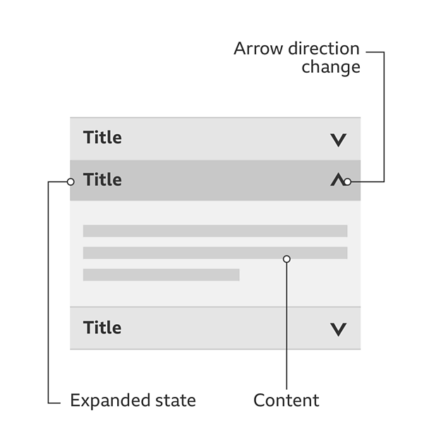
Expanded state: The content panel has expanded showing content. The title should be clearly identifiable in bold with the arrow pointing up, the direction that content will collapse.
Rules
These must be applied for the most suitable and consistent experience:
- An accordion must always expand information below the title.
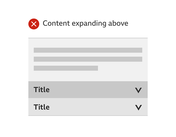
- The title of the accordion must always be labelled bold to show there's an interaction.
- The arrows must face the way the content will expand (when in the default state) or collapse (when in it's expanded state).
- An accordion must always have the same width.
- The title and content needs to feel part of the same thing. Use of subtle colour, shadows or lines can help distinguish between them if needed.
Accessibility
Visual considerations
- A hover state must have a clear contrast with both the collapsed and expanded state.
- Make sure the colour of the text contrasts well with the backgrounds of the collapsed, hover and expanded state.
Considerations when there's no Javascript
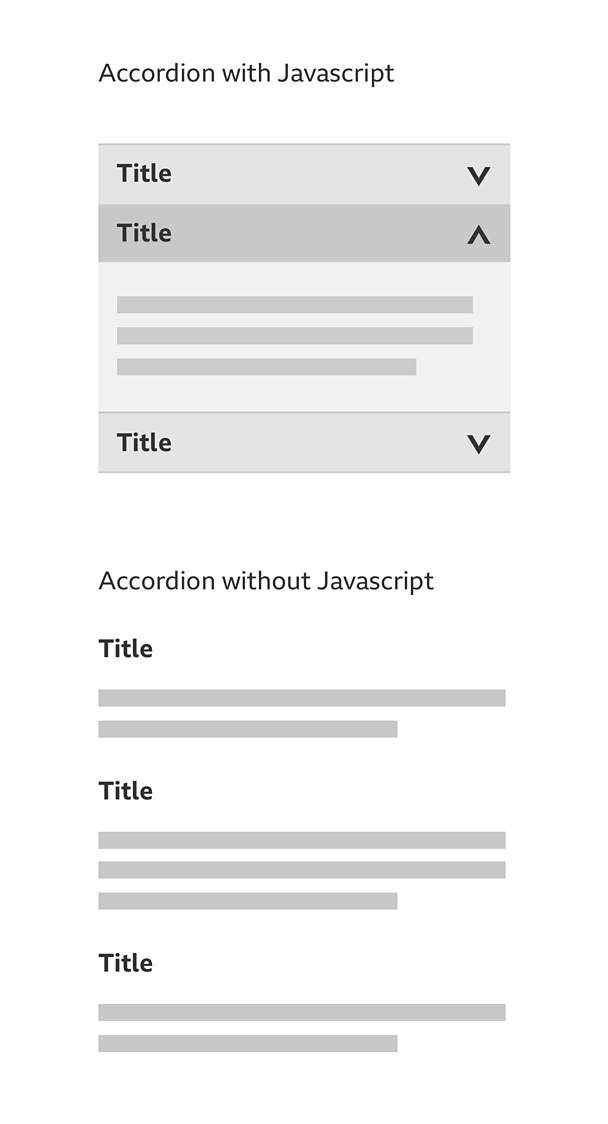
When there's no Javascript the accordion content won't be able to appear as collapsed drawers stacked on top of each other. In cases like this, all of the accordion content should be exposed and separated by headings. These headings will have the same text as the drawer titles.
You may include a list of links before the content to enable people to jump straight to what they want. This solution also works for people who use screen readers without Javascript.
Considerations for screen readers
If you're using a screen reader with Javascript turned on, you should be able to navigate the accordion in the same way as the tab pattern, as follows:
- Use the tab key on your keyboard to access the drawer header.
- Use the return key to expand the drawer.
- On selection, keyboard focus is pushed to the content within the content panel.
Remember, the key questions that people need answering are:
- What drawer am I on?
- How many drawers are there?
- How do I change drawers?
We would recommend using the ARIA tab model. This works across all major screen readers and browser combinations. Find out more about .
Variations
You can limit an accordion to allow only one drawer to be expanded at a specific time. For example if you select a second drawer, it'll automatically collapse the one that was previously expanded.
A drawer can be expanded by default.
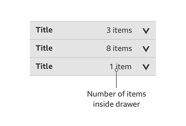
You can give more information about what's inside each drawer. For example, if you have eight items in a drawer, you can show this information alongside the title.
Pattern in action
This pattern is currently being used by ≥…»ÀøÏ ÷ Sport.


