Please read the Licensing terms before you download this content.
Overview
How it works
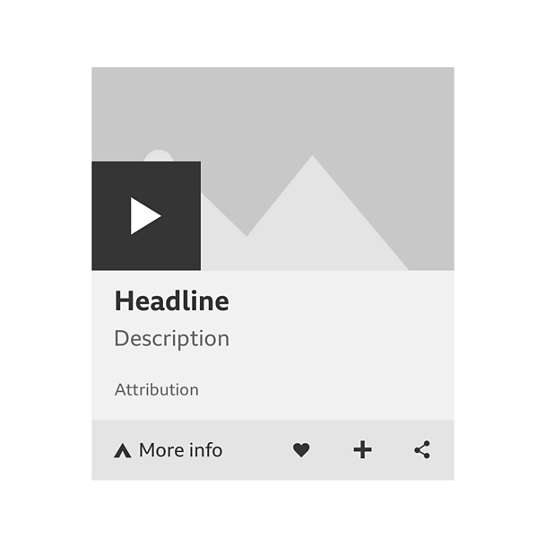
A card is made up of a preview area and a toolbar. The preview area can include things like a piece of video or audio, a gallery, a single image, fact or quote. The toolbar can contain icons and a panel to discover more information.
A key feature of cards is the short video or audio clips. They last about a minute and can be started by selecting the 'play' button on the left.
To find out more about the content, select the 'more info' panel on the left of the toolbar. The card will then expand to show more details, which can be hidden again with the 'close' button.
Note
A card contains elements that are also used in a promo. You should read the promos guideline for more information.
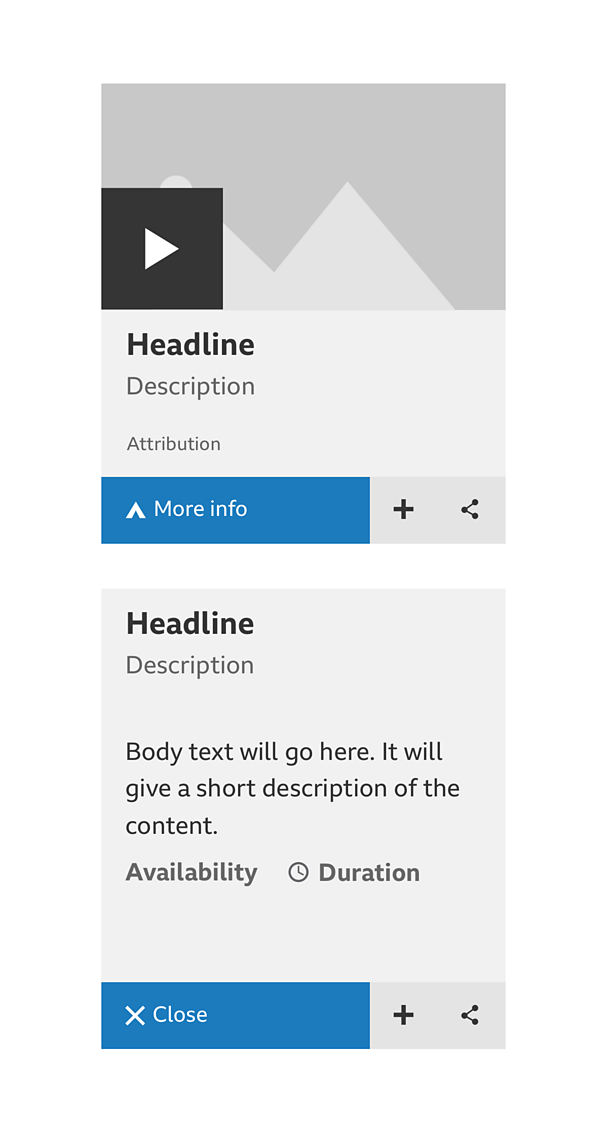
You can share a link to the card's source content by selecting the 'share' icon on the right of the toolbar.
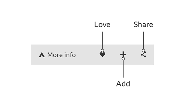
Depending on the product, the toolbar can also let you 'add' or 'share' content using icons.
On some cards, selecting the card title or headline will take you to the content page.
Rules
Cards can have up to twelve parts, which must be shown in this order:
- Media (short clips, no full length iPlayer episodes)
- Image
- Headline (and link to content, if it exists)
- Subheadline
- Contributor
- Timestamp
- Body text
- Quote text
- Fact text
- Playlister
- Attribution
- Toolbar (always at the bottom)
Here are some examples of how these parts come together:
Video card
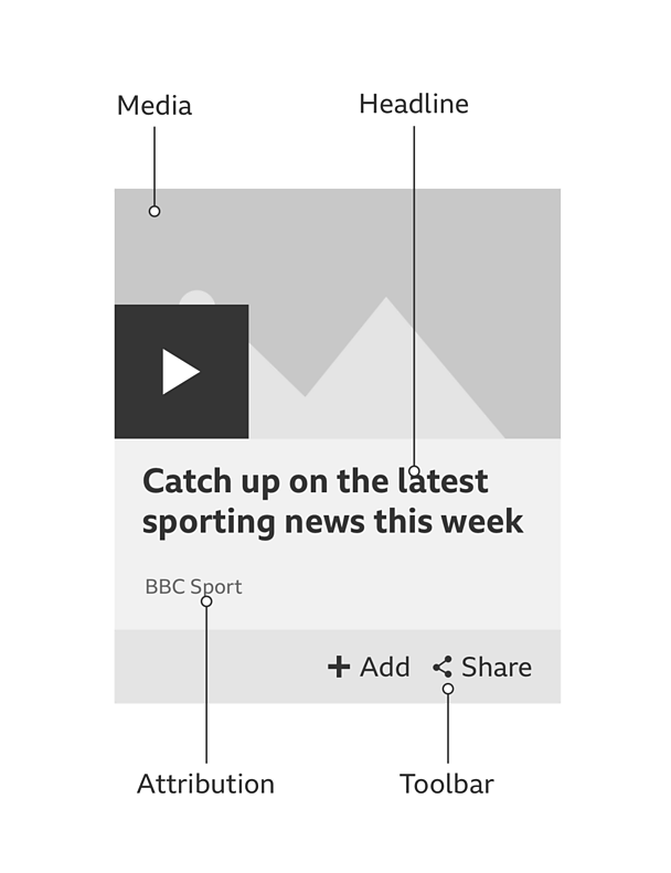
This short video card consists of four parts:
- Video clip (play in-situ)
- Headline (links to clip, article or episode page)
- Attribution
- Toolbar
Audio card
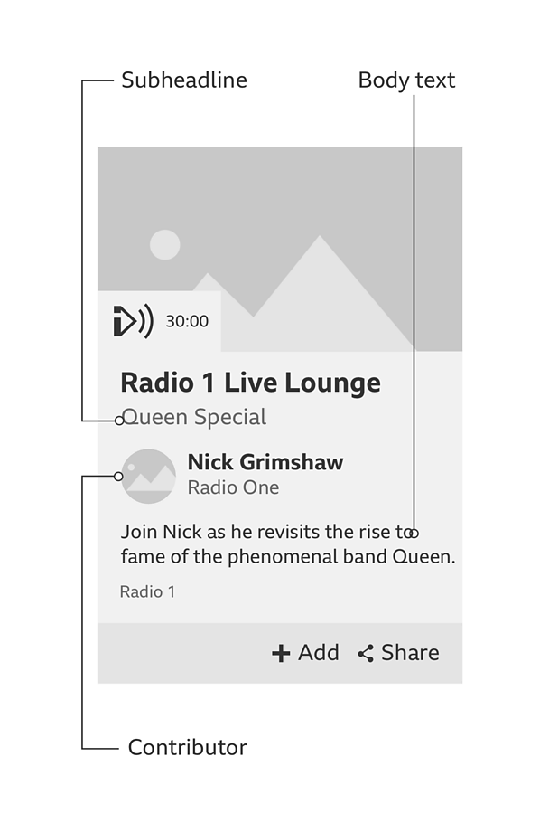
This long audio card consists of four parts:
- Subheadline
- Contributor
- Body text
- Playlister
Short article with body text card
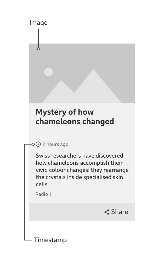
This short article card consists of three parts:
- Image
- Headline (links to article page)
- Toolbar
Quote or fact card
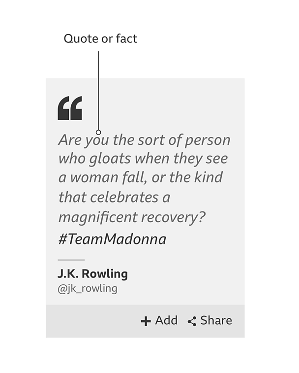
This quote or fact card consists of four parts:
- Quote or fact
- Contributor (quote card only)
- Toolbar
- Background image (optional)
Toolbar
The toolbar can contain a maximum of four features: a 'more info' link and up to three action icons.
The 'more info' panel is optional but if it does appear it always sits on the left. 'More Info' should not be a link. It should open the push-up that reveals more information.
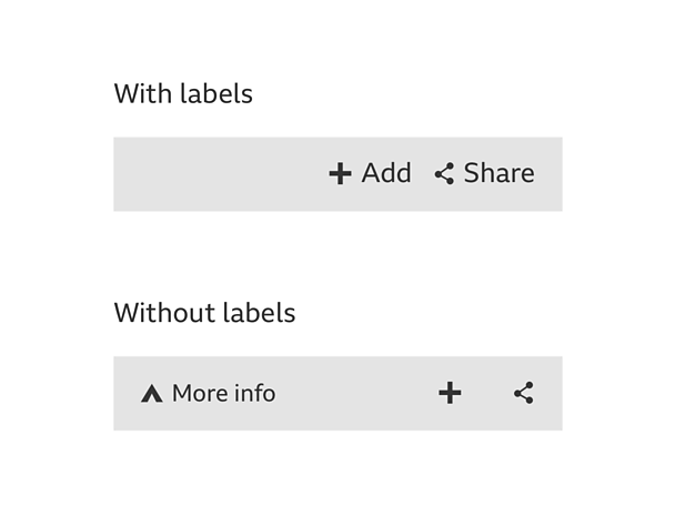
The 'add' and 'share' icons always sit on the right. The order will depend on the importance of the icons in your product. We'd recommend ordering them as 'add' and 'share', unless you have a good reason to change it.
Use labels with the 'add' and 'share' icons if there's enough space on the toolbar. If there isn't enough space, don't use labels.
When cards contain recommended content, you can also use the recommendations feedback guideline in the toolbar.
Card widths
Cards don't have fixed widths so they're flexible to your needs. Here are some recommendations for maximum and minimum widths.
Minimum desktop and mobile: 266 pixels This is based on the minimum Standard Media Player (SMP) width.
Maximum desktop: 50% In special cases you can use the full-width landscape format card.
**Maximum mobile: **100% See the typography guideline for tips on how to handle text when a card is scaled up. When scaling images, remember to always use a 16:9 ratio.
Accessibility
When creating a tab order for the different parts of the card, remember to put the headline before the image or media so that screen-reader users get the context before the image alt tag.
Other rules
- Images should be full bleed and use a 16:9 ratio.
- 'Play-in-place' media should follow the audio visual guidelines (coming soon).
- Card typography is based on the four type hierarchies in the typography guidelines.
- Attribution names should be no longer than one line.
- Different coloured backgrounds can be used as needed by the product.
- Cards can have many different heights but where cards appear in rows, we recommend they take on the height of the tallest card in that row.
Variations
Some products won't have the share function (e.g. Children's).
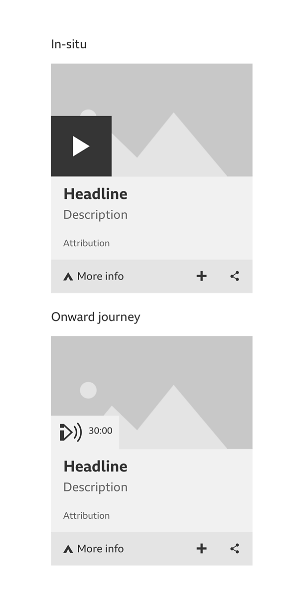
A card can handle media in two ways: the media can play in-situ or it be reached through an onward journey. The 'play' icons for these onward journeys are different. They can include product branding and duration, and they're coloured the same as the area below the media.
Full-width cards
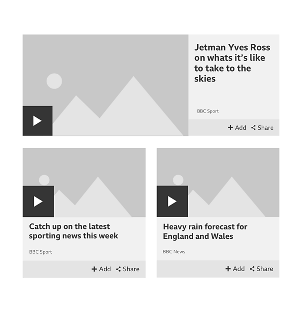
If you only have one card to show, and you want to restrict the height that it takes up, you can use a full-width card.
Another good use for this variation is when you have three cards to show but there isn't enough space to fit them in. This happens on tablet, where three cards don't fit in a row.
If you pushed the third card onto a new row, it would look odd on its own and also take up more height. The answer is to have two cards on one row with a full-width card above them.
Licensing
These assets are available for download on the following licence terms:
You can:
- Download the assets and use them free of charge;
- Use the assets without attribution; and
- Modify or alter the assets and edit them as you like.
You can't:
- Use the assets in a way that would bring the 成人快手 into disrepute;
- Make available the assets so that they can be downloaded by others;
- Sell the assets to other people or package the assets with others that are for sale;
- Take payment from others to access the assets (including putting them behind a paywall);
- Use the assets as part of a service that you are charging money for; or
- Imply association with or endorsement from the 成人快手 by using the assets.
Disclaimer: The assets are offered as is and the 成人快手 is not responsible for anything that happens if you use them.


