We want you (yes you)!
If you are starting out in design or switching into the field, we've got you covered here. Perhaps the pandemic or life changes have made you re-evaluate your career dreams. Maybe you have just finished university this summer and are now looking for a job you'll love. Whoever you are, if you are applying for a job in design, you'll need some sort of portfolio to show off your work.
For our UX Design Trainee role we're not looking for loads of experience or specific training in UX, you'll learn loads as part of the scheme. Instead, we're looking for people who are super passionate about design, with tons of enthusiasm for tackling complex design challenges.
Wondering what the trainee scheme is?
We run the design trainee scheme every year, so keep an eye out for the latest details on the łÉČËżěĘÖ Careers site.
So you've decided to apply and you're ready to start thinking about your portfolio?
Great, you're in the right place! Before we jump into our top tips, let's briefly touch on some groundwork.
When thinking about content for your portfolio, you'll want to pick a handful of projects that best show off your skills. These can be UX specific, UX-adjacent or super transferrable skills so it's worth taking some time to give this a good ponder.
Next, choose a format that best suits your style and area of focus. Whether you are a budding visual designer, architect, content designer or none of the above, there's a style to suit you. There's no one size fits all here, you are unique with your own talents and things that drive you, so let that shine through.
So without further ado, read on and learn how to pull together a design portfolio and get the top tips from our current UX Design Trainees.
1. Explain your design process
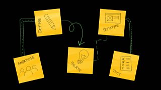
We've all been there. You've spent countless hours perfecting your designs and now you want to show off your hard work to the world. And you should! But when it comes to your portfolio, the process, rather than the end result is the most important factor.
Consider using your designs as the lure to your case study to get the reader intrigued. Your final designs are the bread crumbs that say, 'There's more great stuff where that came from. This way!'
Once you've got someone into your case study, start from the beginning. What was the brief you were answering? What were the deliverables? Were you in a team or working alone?
Then go on to talk about how you got to that final piece of work. It's all about the journey. What research techniques did you use and why? What were some of the key findings and what did you learn? Why did you make the decisions that you did? You get the idea, remember context is crucial.
2. Tell a captivating story

Being a great storyteller is a useful skill to have. You will use storytelling throughout your career to share your design ideas with others and get them on board. And you should use it in your portfolio too!
All good stories have what's known as a narrative arc where the tale builds to a peak and falls to a conclusion. It starts by setting the scene. Then let's say an obstacle pops up that needs to be overcome. The reader's interest is piqued. The story builds, drama ensues, and adventures are afoot resulting in the height of the story! But wait, another obstacle! How will they get out of this one? Fear not, the hero saves the day and all is well…or not. What a roller coaster!
You don't need to turn every case study into a dramatic fairytale (no capes or baddies necessary). But if you follow a similar format detailing the highs and lows of the project, you'll keep the reader not only engaged but wanting more. And the more they read, the more they'll get to know you and the great work you did.
Don't forget that images also help to tell a story. Visual elements like design sketches or photos of you in action often get to the point quicker and can be more impactful than plain old text so use them to your advantage.
3. Talk about what went wrong

Talking about the highs and lows, we all love a success story but life isn't always so peachy. It's important to be able to identify where things didn't go so well during your project too.
But why talk about what went wrong, isn't that going to make me look bad? Well no, the opposite in fact! Sharing the challenges you have faced not only shows you are a relatable human being, but it also works to reflect on your skills in how you manage complex situations. Are you calm, cool and collected during a project crisis? Do you bring in your organisational skills to save the day? Perhaps you can show effective team working by collaborating with others.
Things go wrong and we all make mistakes, but they are there to learn from and make us better so identify any challenges you might have faced, explain your thinking behind it and describe what alternatives you might consider for next time. This will show your flexibility, an open mind and a willingness to learn.
4. Apply UX design thinking to your own portfolio
Your goal here is to bag a role in User Experience and Design, so make sure you pull out those core UX skills where you can when talking about your work.
Did you conduct user research - bingo, that screams UX! Did you analyse the data - jackpot! How did you do it, and what did you learn? Did you iterate on your designs - winner! We love design iterations, tell us more. You don't need to check off every UX buzzword in your portfolio, but having the design process in mind shows you're starting to think on the right lines.
Remember, seeing a photo of a workshop in action or you running a card sorting session really helps bring the story to life in a much more succinct way. Images can help make your point quicker and clearer than words so where you can, use them!
Also keep in mind the area of UX you're applying for, whether that be in Design, Research, Content Design or Architecture for example, and tailor your portfolio accordingly. UX Design is a visual role so consider how your portfolio looks. Show you've thought about the use of colour, the fonts, the layout and the flow. If you're going for a Researcher role, your portfolio may be a little less visual and more focussed on your research methods, analysis and outcomes. Use your portfolio itself as an example of your UX skills whatever area they fall under.
5. Show off your transferrable skills

And finally, you don't have to hold a degree in Design to show an understanding and passion for learning UX. Remember, this is a trainee scheme. As long as you can display relevant skills from previous careers, qualifications or experiences, that's what counts.
Consider non-UX projects and side hustles. Do you practice painting in your spare time? This might show a creative flair and a dedication to the craft. Have you taken a class on how to achieve something you couldn't do before? That might highlight a drive to learn and grow. Be a detective to uncover your skills and show off the best ones.
Final top tips!

- Make it count. Every word and image in your portfolio should be selling you and your skills. If not, leave it out.
- Keep your case studies to a small handful - it's about quality, not quantity.
- Make sure you check all your links are working.
- Online is your friend. Research other UX portfolios for inspiration and look at websites that help you build your own portfolio if needed.
- Lastly, have fun! This is a chance to show a little bit of who you are and your personality. We want to see who you are, so jump right in and be yourself!
We run the design trainee scheme every year, so keep an eye out for the latest details on the łÉČËżěĘÖ Careers site.
Also be sure to follow us on on and
Special thanks to Al Jones, Creative Director, Hazel Wyllie and Sarrah Mohammed, UX Designer and Emma Plant, UX&D Delivery Manager. Additional Illustrations by Nichola Evans.


