Key considerations
Consider the following key points to make sure your newsletter content is accessible for everyone.
Logical reading order
Keep the reading order logical, to enable screen readers to read the text aloud and in order. A logical reading order helps all users to pull out key information quicker.
Heading tags
Heading tags form a structure for a newsletter or a webpage and help screen readers establish a hierarchy of information. When headers are not present within a newsletter the sense of structure is lost and screen readers have no headers to read out to the user.
Headers are recognised by screen readers by scanning through the code to find 'h1' and 'h2' elements.
Font type and size
Consider the font size for visually impaired users. Anything below 14pts in a browser can be difficult to read. Choose fonts that are evenly spaced and not too condensed.
It is important not to rely on the appearance of the font to convey the meaning and not to use fancy fonts like script fonts or more decorative typefaces. Keep the use of different fonts and type styles (regular, bold, italic or capitals) to a minimum.
Colour
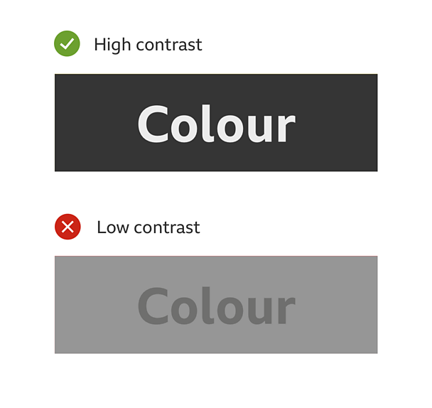
Consider how different users perceive colours and choose a colour scheme accordingly. Its important to remember that users with colour blindness will see things differently.
Avoid having the text and background in similar colours. Always remember the basic colour arrangement, dark text on light backgrounds and light text on dark backgrounds. To find out more about colour contrast rules, visit the łÉČËżěĘÖ mobile accessibility guidelines for colour contrast.

Alternative text for images
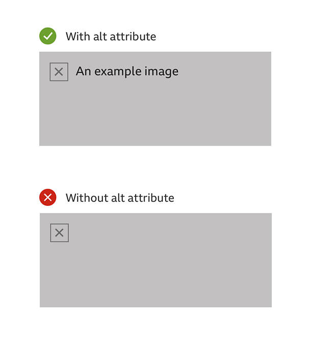
Add alternative text (or alt attributes) to imagery to enable screen reader users to gain a full experience from the newsletter. Alt attributes are important because they enable screen readers to describe the editorial intent of the use of the image to a visually impaired user. Without the alt attribute the user will only be told that there is an image, but with no description or context of the image. Use empty alt attributes for any decorative and non-editorial images.
Think about how relevant the text description is. Learn to apply alt attributes to images and to recognise if alt attributes have been used.

Meaningful link text
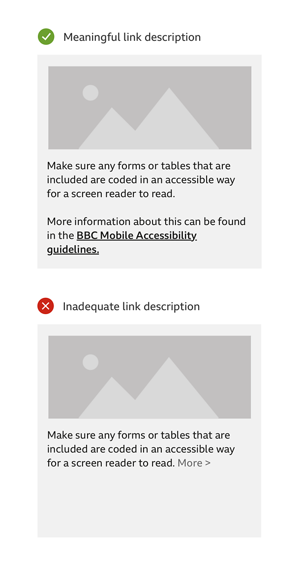
Think about how relevant the language of the link text is. Avoid generic link text such as 'click here' and 'more' in favour of more descriptive alternatives.
Consider that not all users can distinguish between colours so make links obvious and the placement of them logical.
Replace any URLs used with meaningful text (this can be easily done using the shortcut ctrl+k or cmd+k in most software). Then provide a list of the hidden URLs alongside their replacement text at the end of the email under a heading called something like "Hidden Links". That way if the user does need the specific address it is still available, but it doesn't interrupt the flow of text.

Neat and concise code
If coding an email, keep code neat and concise to help the users of screen readers recognise hierarchy and structure. Make sure any forms or tables that are included are coded in an accessible way for a screen reader to read. More information for developers can be found in the łÉČËżěĘÖ HTML accessibility guide.
Responsive design
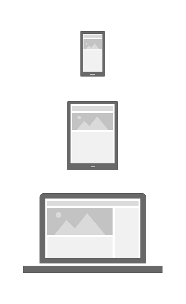
A newsletter may look fine on a desktop, but it also needs to work well on a mobile device too. Responsive design is able to give form and structure for digital content, which helps all accessibility types.
Most newsletter services have this function built in. It is worth checking your newsletter on a phone before sending it out.

Text only option
(Multi part MIME format - Multipurpose Internet Mail Extensions).
Make sure your email newsletter has a text only option so colleagues can decide which format they prefer using.
Keep the formatting ragged
Left aligned 'ragged' text is easier for many people to follow. Make sure that line lengths are not too long, approx. 50 - 70 characters per line.
Tips for accessibility
Plan
It is a good idea to plan out your newsletter to see how it will be laid out in sections. Using headers will also help to strengthen the layout. This will improve the screen reader's ability to structure the content.
Keep it simple
Try not to complicate your newsletter, for example frequently changing the layout, using metaphors and using too many different colours.
Keep it short
Get straight to the point and do not over elaborate on a topic, as it maybe to difficult for people to keep track and they may lose interest. Instead give a link to a full article.
Review
Remember to go through the key points in this guide to see if your newsletter meets the requirements to make it accessible.


